client
Deutsche Bahn
project
DB ICE Screens
year
2020-2021
Brief
Enhancing the accessibility and delight of eco-friendly travel by improving passenger information displays on long-distance trains.
Displays are an indispensable source of information on trains operated by the Deutsche Bahn. They provide up-to-date information about the trip, contribute to a sense of security, and are always available, independent of one's personal device. They are a central element in the interior of the flagships of the long-distance fleet and serve a vast range of customers every day.
Deutsche Bahn has used a solution in service for many years. There was customer feedback about unmet needs and hard-to-understand information. The design didn't fit the corporate design of Deutsche Bahn and created a break in the otherwise relatively seamless use of the brand elements and tokens. It was time to improve the information, make it more approachable, and apply a modern, contemporary design in line with Deutsche Bahn brand guidelines.
Approach
A modular design for the in-train displays was developed over several iterations and validated through numerous user tests.
Learning from what worked in the past and what the researchers collected as feedback from customers and employees, we embarked on a journey with Deutsche Bahn. After several concept iterations and rounds of qualitative and quantitative tests, the team honed the design to fulfill all brand, regulatory, and taste requirements while remaining feasible to implement and run on the existing hardware.
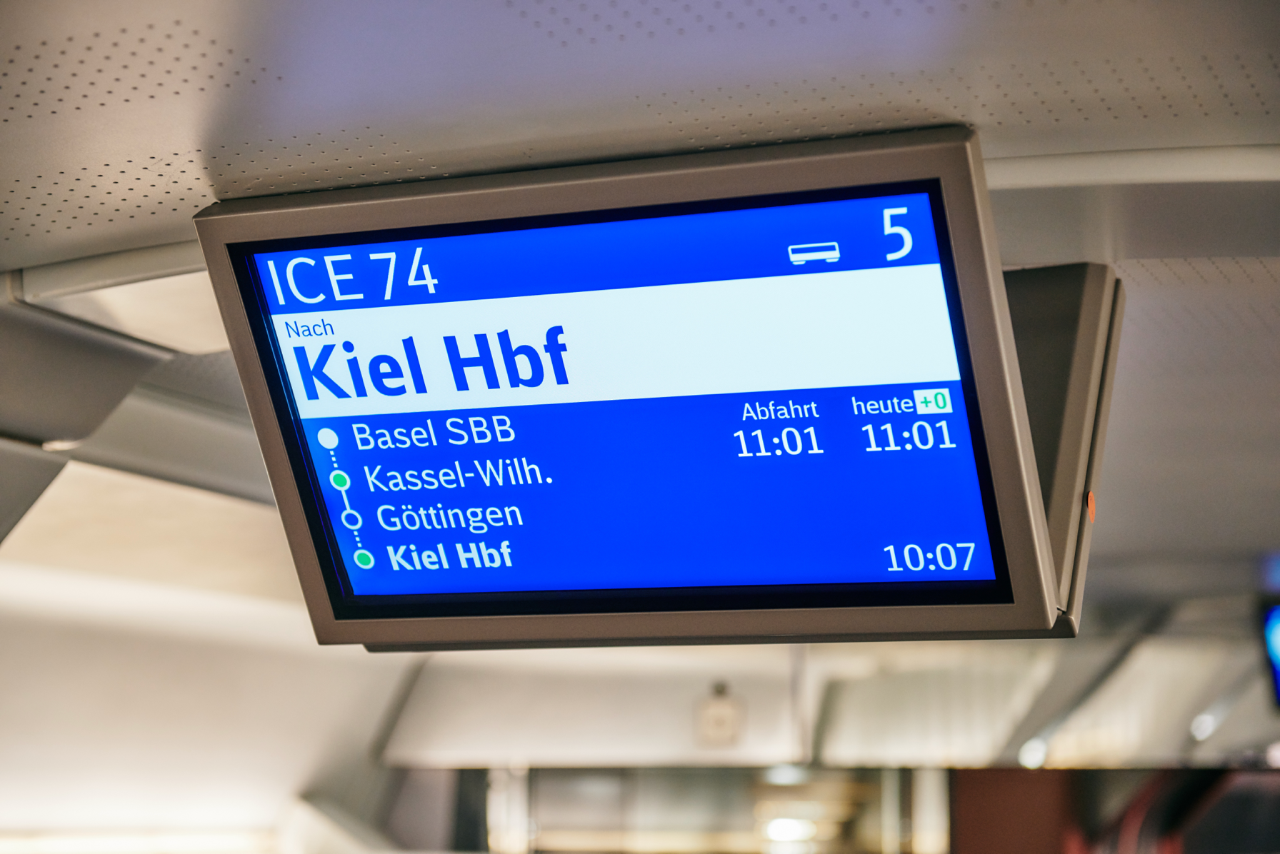
1 / 5
The Blue Screen
The starting point of the journey: the blue screen layout used for many years across the DB fleet
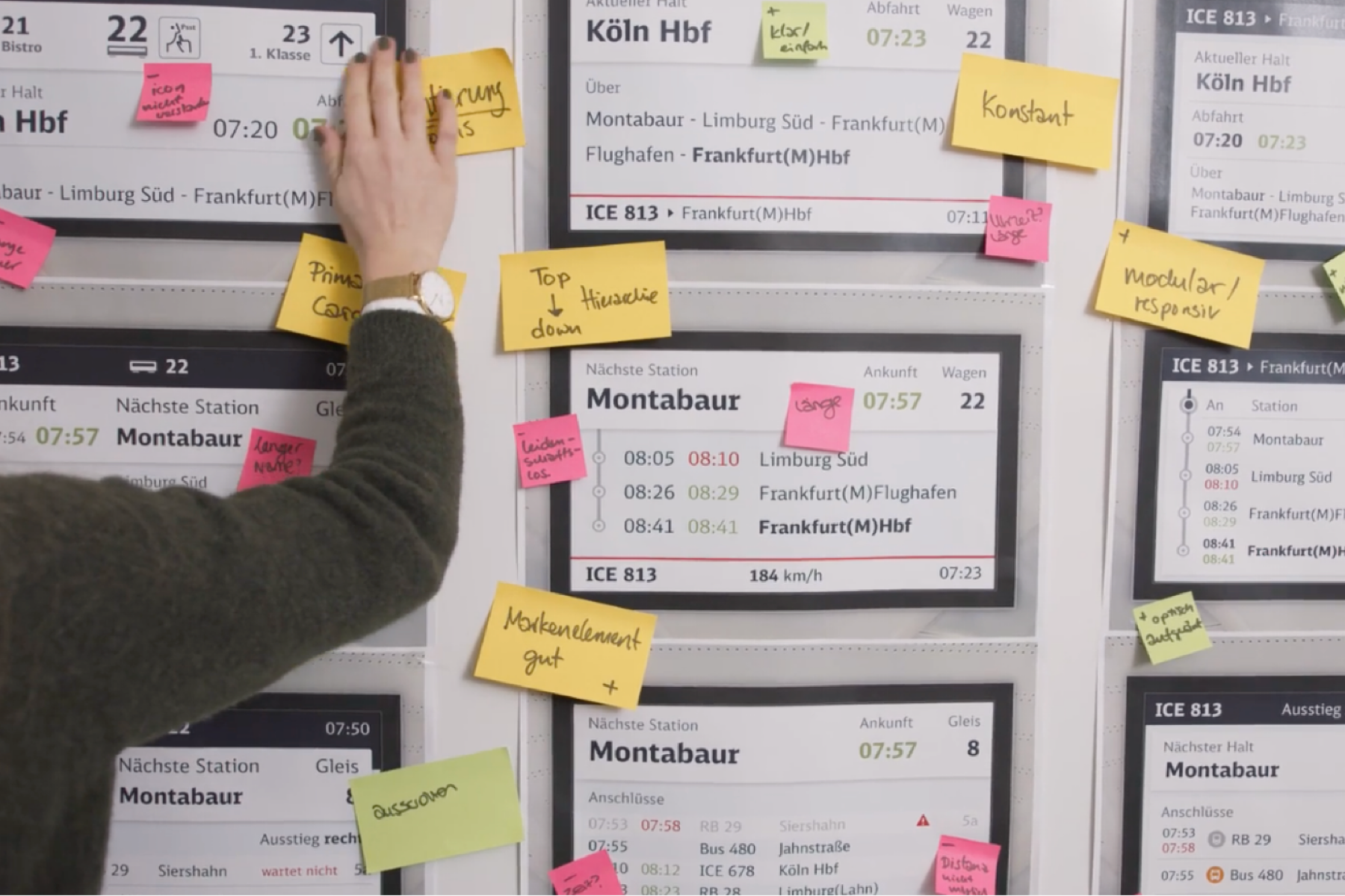
2 / 5
Iterative Process
Three initial design directions where tested and distilled into one brand expression
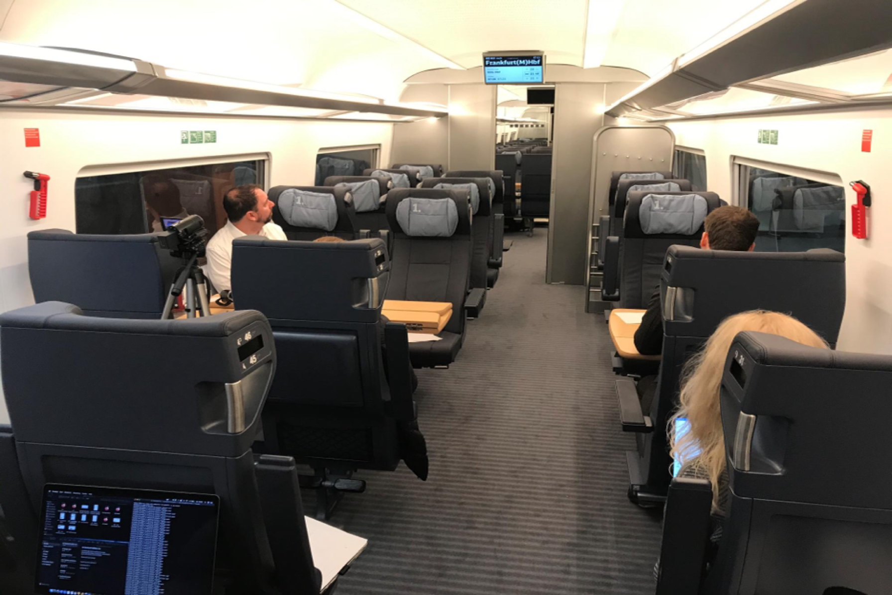
3 / 5
Thorough Validation
Research methods used included qualitative individual interviews in a simulated train environment
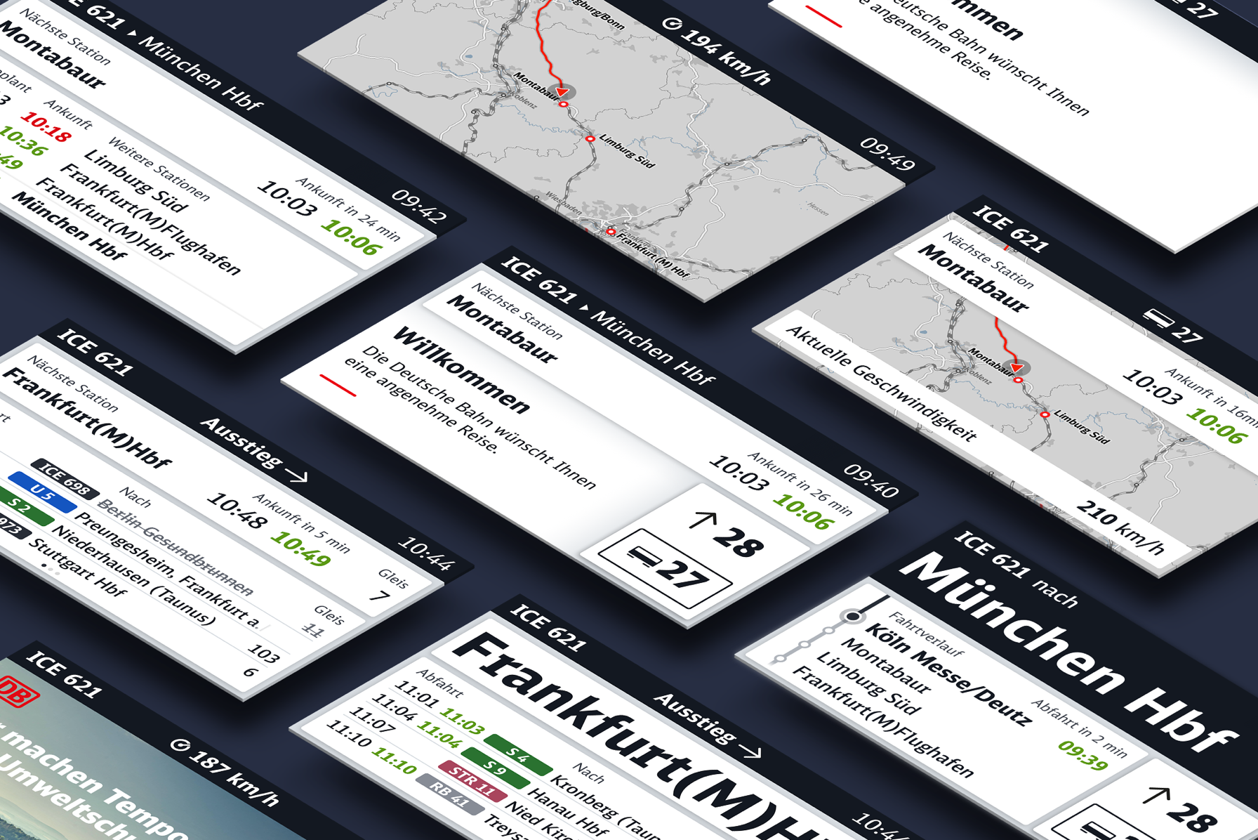
4 / 5
Modular System
A future-proof and scalable design system fit for varoious resolution and aspect ratios
5 / 5
Fleetwide Rollout
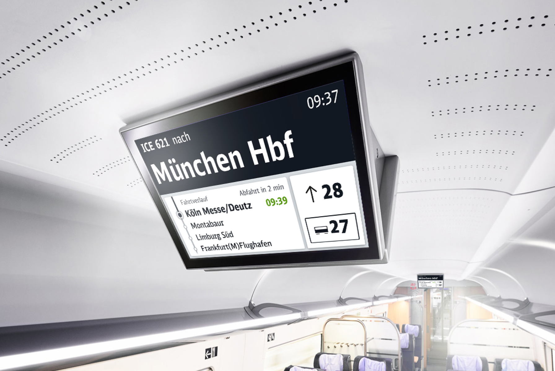
The new design is being rolled out across the ICE fleet of Deutsche Bahn and beyond
Project
Over 98 million passengers annually travel with an ICE and rely on in-train information displays — a once-in-a-lifetime opportunity to redesign an icon of transportation.
The ICE train is the flagship of Deutsche Bahn and an icon for fast, comfortable, and sustainable travel in Germany. Since its introduction in 1991, it carried over 1.5 billion passengers. It featured multiple versions of more and more advanced passenger information displays. Deutsche Bahn chose zigzag to collaborate on creating the new generation of this information system to align the design and layouts with the latest brand guidelines. After thorough testing, iteration, and pilot phases, the redesign is being rolled across the ICE fleet. It gets positive reviews from passengers and has won several international design awards.
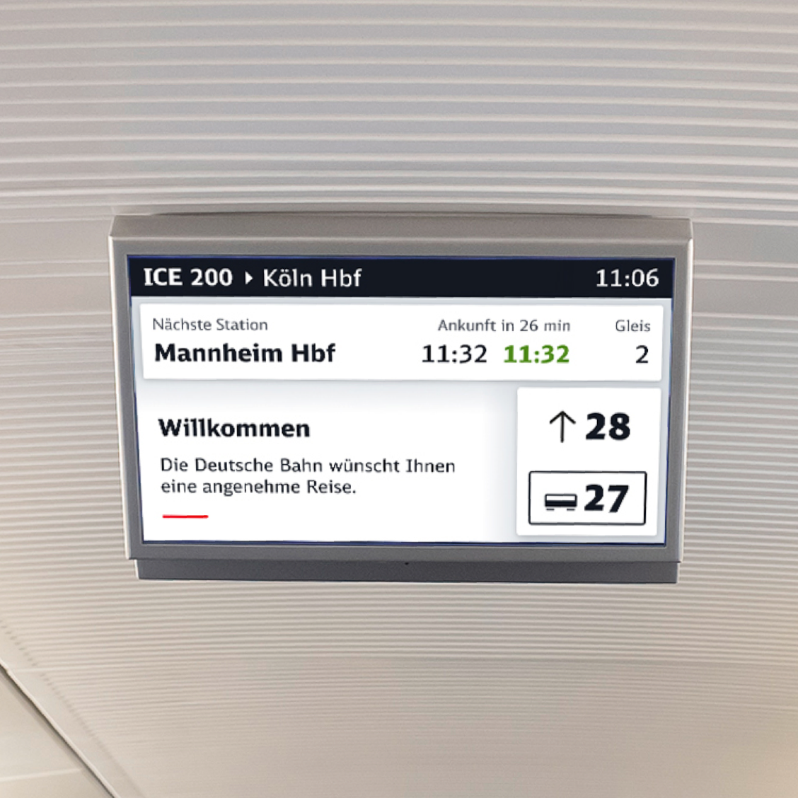
We expanded Deutsche Bahn's design system with a unique medium: in-train displays, demonstrating that branding goes beyond a logo with the correct application of identity fonts and colors. The final designs showcase the scalable, future-proof nature of modular design suited for diverse information and display sizes. Tile size and placement adapt based on the significance and context of the information. Future hardware could enable more intricate animations, as our prototypes showcased, using visual transitions to guide users effectively through their journey.
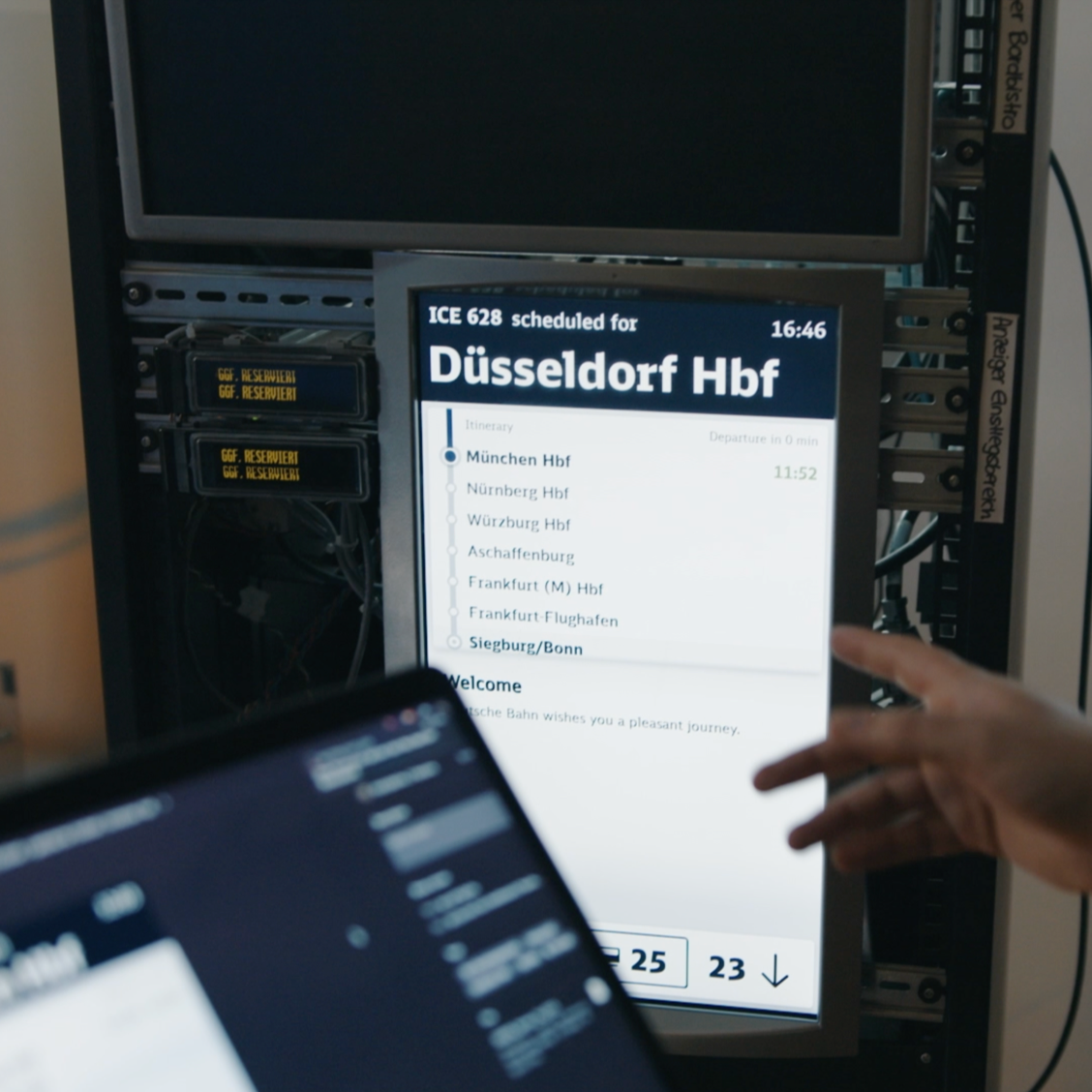
One decisive constraint we had to work with was that Deutsche Bahn wasn't going to upgrade the hardware of the information system. Displays and compute units remained the same, which limited the possibility of introducing animations and transitions. It also made working closely with development a necessity. Our knowledge in creating functional prototypes facilitated us to establish an HTML-based solution suitable for future testing and implementation phases in the Chromium-based browser. This streamlined the project and saved significant time and effort.
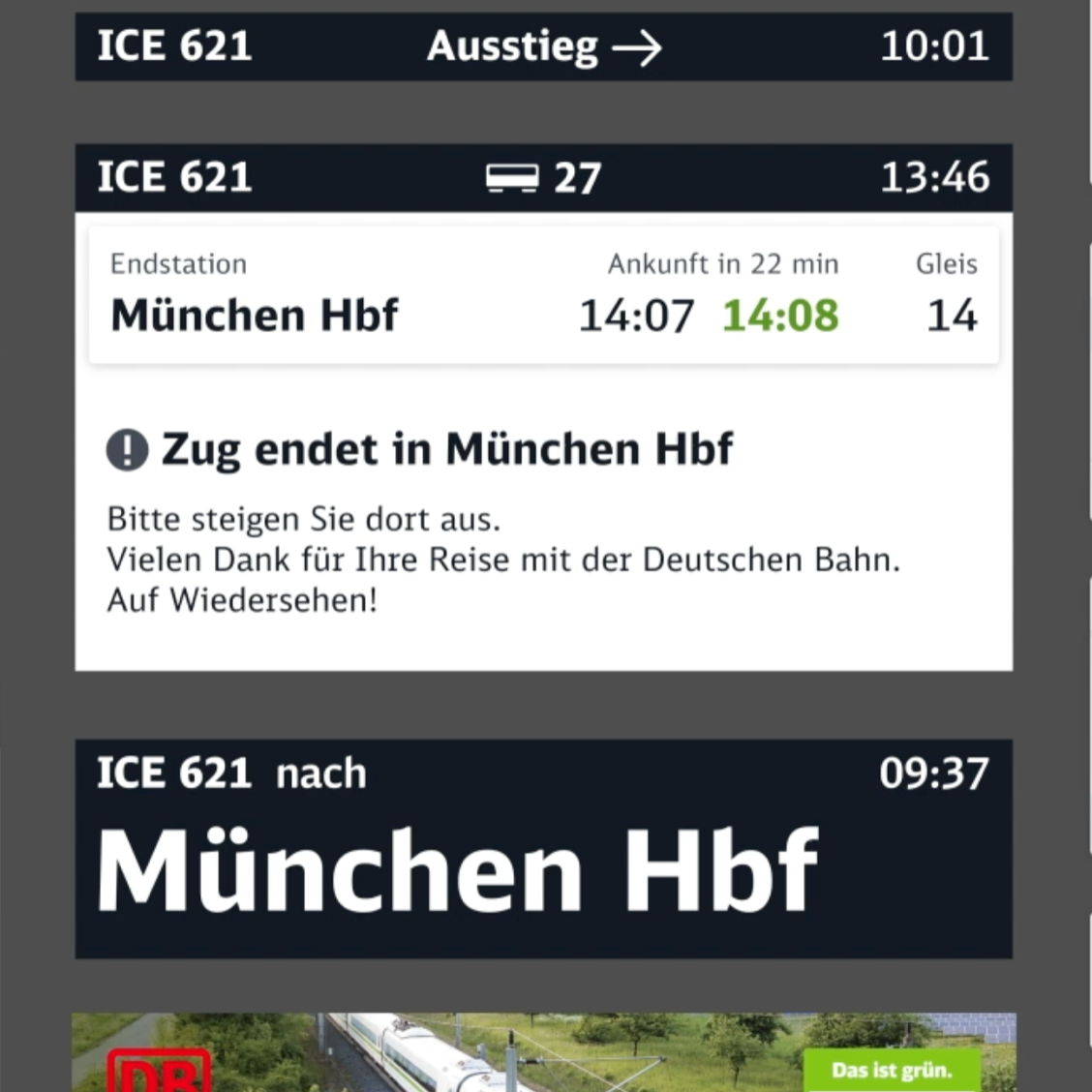
To ensure compliance with the European Railway Agency's (ERA) "Technical Specification for Interoperability" (TSI), we faced the significant task of making screen content accessible and TSI compliant. Our two primary challenges were securing a sufficient color contrast ratio (3:1 for larger and 4.5:1 for regular fonts) per WCAG AA Standard and achieving a 35mm cap height for text/content for certain passenger information per TSI guidelines. The result is a modern, flexible design that complies with TSI standards and includes all passengers.
Rolled out
More
Business with zigzag
Let’s work together to create next-generation products, services and experiences.
Join our team
Looking for new challenges to work, learn and grow? Join the best team of creatives.
© 2012 - 2024 zigzag GmbH
zigzag proudly runs on renewable power provided by Green Planet Energy.
